

Imagine this: you’re looking at a new codebase, and you want to find the code for a specific function.
For example, in the create-react-app codebase,
How quickly can you find a test for
react-dev-utils?
That wasn’t terribly difficult, but it also probably took a bit of time and exploration. Can we do better?
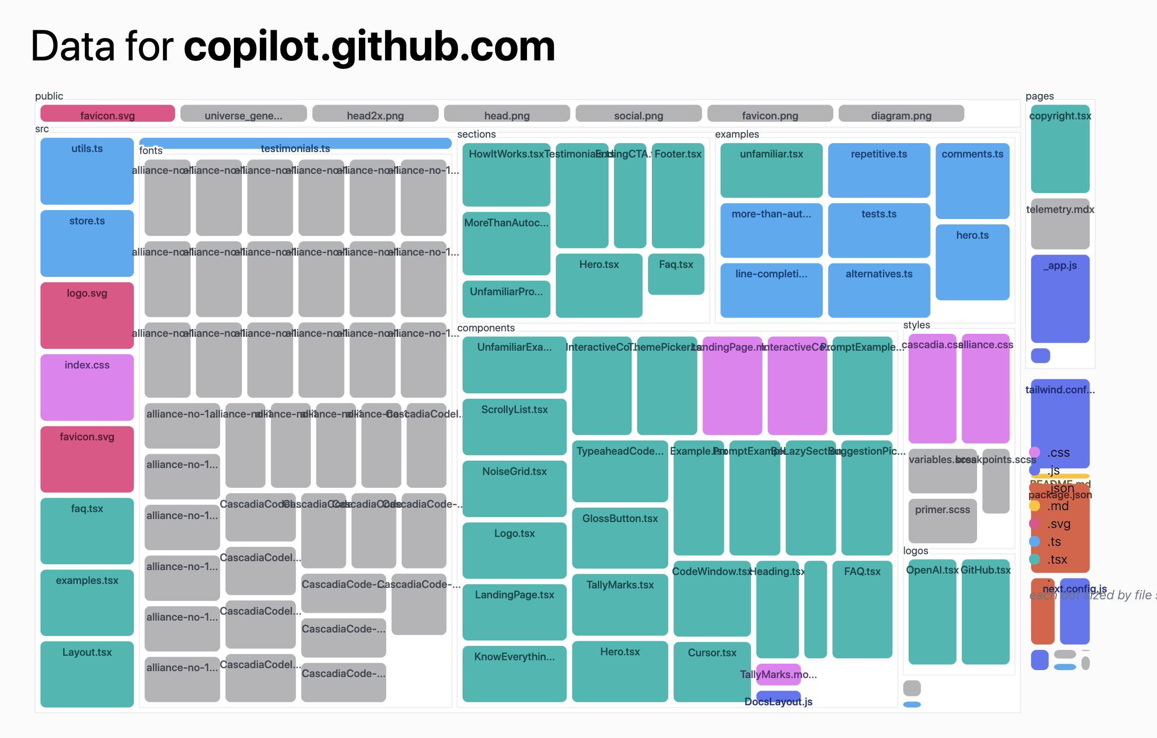
Instead of the typical folders & files view, we can create a visual representation of the code. Below, I've visualized the same repository, but instead of a directory structure, each file and folder as a circle: the circle’s color is the type of file, and the circle’s size represents the size of the file.
This visualization gives enough of a “fingerprint” that viewers can glance at it and see the structure of the codebase. When we look at several codebases side-by-side, we can see how much variety there is between them:


Once you’re familiar with the visual language, it becomes much easier to see similarities, differences, and patterns across codebases.
Our main goal was to present a “bird’s eye view” of a codebase - a “fingerprint” that would give viewers a sense of what was in the codebase, but not overwhelm with data. Not to show all of the same information viewers can get from the folder/file view of the codebase, but to supplement that.
To start, I created a Node.js script that cloned a GitHub repo, analyzed it, and returned a deeply nested tree structure of the contained files and folders.
There are a few classic ways to visualize a nested tree structure. I experimented with tree maps, node-link diagrams, circle packing, and even a more novel layout which shows direct children encircling folders.
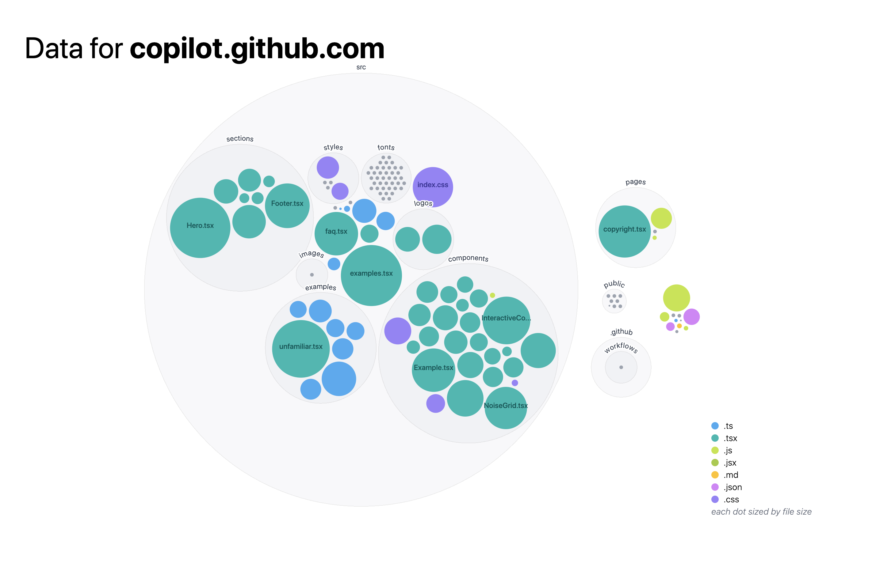
I settled on a circle packing layout, which takes up more space than other methods, but felt the most clear about what was nested inside of what. Here’s a close-up of the layout I settled on:

The visualizations were built using React.js and D3.js. The nodes were placed using the D3.js packing method, then recursively relaxed using a D3.js force simulation.
Re-laying out the nodes was important to fit the nodes to the SVG bounds, and to keep transitions smooth when animating the codebase over git history (see below).
Explore for yourself!
Try it out for yourself! Check out your own repositories or ones you’re curious about.
You can also create a direct link to your own repository.
But this website isn’t part of our current workflow - how could we integrate this visualization so that it becomes familiar enough to supplement our daily work?
Integrate into your own projects
If we add the diagram to our README, we can see it every time we work on the codebase. This kind of regular viewing can make us familiar with the shape of our codebase, giving us a baseline to detect and understand large changes in structure.
To make this easy to integrate, I built a GitHub Action to generate a diagram, and update it every time the codebase changes.
To use it, you just need to:
-
create a new GitHub Action by adding a
.ymlfile inside the.github/workflowsdirectory. For example:.github/workflows/create-diagram.yml -
add the
actions/checkoutandgithubocto/repo-visualizerActions -
Add the diagram image to your README:
 -
Once you push, you can watch the Action run in the Actions tab of your repository. Within a minute, you should have a visualization of your codebase in your README. Watch it update whenever the code is updated!
You can see an example of this in action in the githubocto/repo-visualizer-demo repository. Read more and check out the code at githubocto/repo-visualizer.
Potential future directions
I timeboxed my exploration, but there are many ways to continue to exploring this space. A few in particular stood out to us as useful.
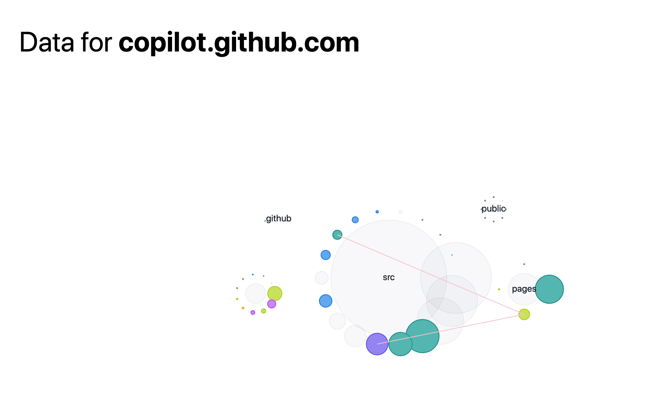
What files are connected?
When developing within a repo, it’s important to know how data flows from one file to the next. What files are imported into others, and what files stand alone?
To find these connections, I scanned the contents of each file for import statements, then linked that file with the one it imports from. There are often too many connections happening at once, so I only show connections from & to a file on hover.
Let’s look how a few React.js animation libraries are organized.
Where are changes made?
So far, I’ve only looked at file size and type, but there are many other metrics that can tell us about our codebases.
For example, where in the codebase are the most recent changes? This could be helpful for quickly getting up-to-date after a break, or to see which parts of the codebase are being neglected.
In the useHooks.ts codebase, we can see which hooks were most recently
edited (useLocalStorage, useCounted, & useBoolean), and which parts haven’t changed recently (the
favicon, legacy code, and the useScript hook).


Or, we could look at what files change the most often. This could be helpful for finding the most important files to keep an eye on, or for finding stale code.
For example, in the d3-geo codebase, the README file is always being updated, as well as the index.js file that imports all of the projections.
How has a codebase changed?
Now that we know our way around this visualization, we can start looking at changes over time. How has the structure grown over time? Does the code get updated one section at a time, or all at once?
Feedback
This is really the tip of the iceberg! I’ve taken an initial peek into how visualizing codebases could be helpful for developers day-to-day. We would love to see other explorations or hear your thoughts. Tweet us at @GitHubNext or send us an email at next@github.com.
✌️ ❤️
GitHub Next
Developer Experience Team