

We build a lot of webviews for Visual Studio Code at GitHub Next. Given our team's collective experience in web development – particularly with React – webviews have become the perfect canvas for rapid prototyping and experimentation. That said, the VS Code team advises developers to use webviews sparingly, as the risk for creating experiences that feel inconsistent with the editor is quite high.
You might recall Flat Editor, one of our first official forays into webview development. The team worked tirelessly to ensure that this GUI for authoring Flat actions felt "native" to VS Code. The GUI looked beautiful across different VS Code themes, and adhered to the visual design standards of VS Code that we ourselves were able to ascertain.
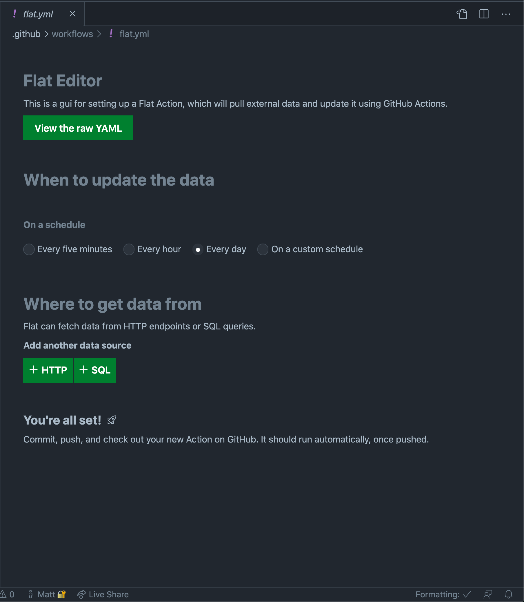
Despite this being an iframe embedded into VS Code, it "feels" native insofar as it uses the current theme colors and replicates built-in form controls such as radio buttons. There are some oddities, however, such as the lack of differentiation between primary and secondary action buttons.
One such byproduct of this effort was the tailwind-vscode package, which allowed us to hook into the current VS Code theme (expressed through CSS variables) via a special set of Tailwind classes.
// vscode-input-background is one such CSS variable at our disposal.
// Let's apply it to the background of this input.
<input className="bg-vscode-input-background text-vscode-input-foreground" />
Text field rendered in a dark theme.
Text field rendered in a light theme.
While we were certainly proud of our handiwork, after we shipped Flat Editor we couldn't help but wonder: wouldn't it be nice if there were an official component library for authoring VS Code webviews that look beautiful across themes?
That's when we learned about the Webview UI Toolkit for Visual Studio Code.
Webview UI Toolkit for Visual Studio Code
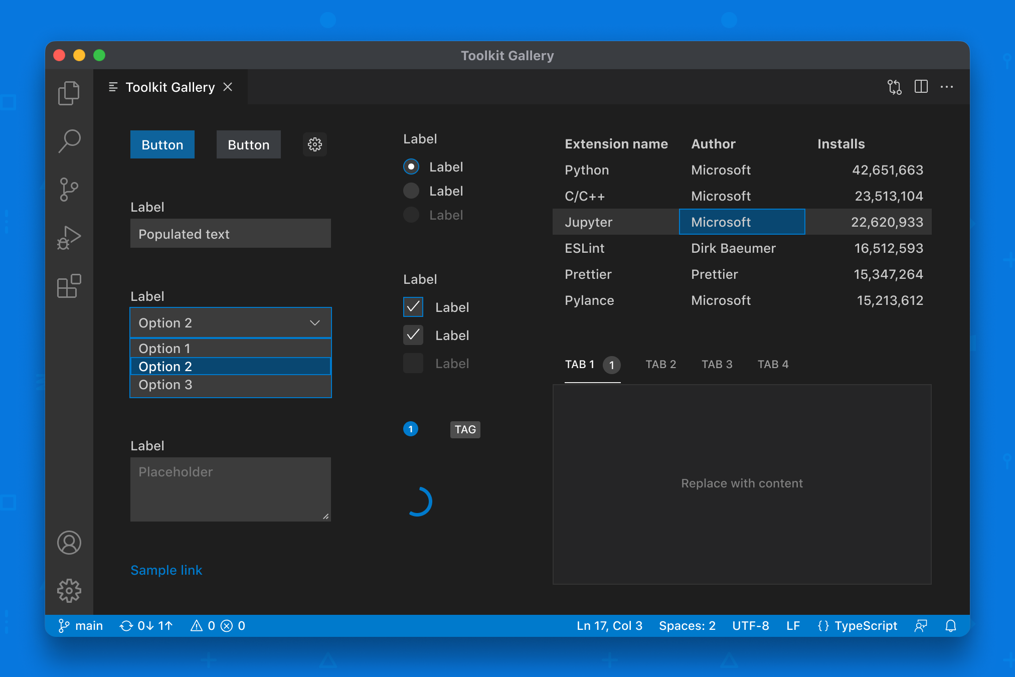
The components available in version 0.9.0 of the library.
The Webview UI Toolkit for Visual Studio Code is a collection of accessible web components that follow the design language of VS Code. From the team's announcement blog post:
“With this toolkit, extension developers can quickly and easily create webview-based extensions in Visual Studio Code that look, feel, and act like the editor itself.”
This mission statement piqued our curiosity, but we didn't quite have a game plan for integrating these web components into our various webview projects. We had invested deeply in React, and a rewrite was out of the question. That's when we started to research how we might be able to "React-ify" these toolkit components.
FAST
As we learned, the underlying toolkit components are powered by a Microsoft project called FAST. And as it turns out, FAST exposes a dedicated API for converting web components into React components. Jackpot!
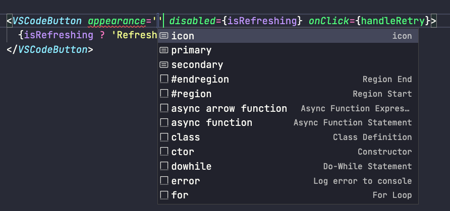
We conducted an experiment to see how difficult it would be to convert the toolkit components. All things considered, it was painless. The following code snippet illustrates the process for converting one such vsCodeButton web component into its React counterpart.
// Abridged sample from the React component manifest in the vscode-webview-ui-toolkit repo.
// https://github.com/microsoft/vscode-webview-ui-toolkit/blob/main/src/react/index.ts
import { provideReactWrapper } from '@microsoft/fast-react-wrapper'
import { vsCodeButton } from '../index'
import { provideVSCodeDesignSystem } from '../vscode-design-system'

const { wrap } = provideReactWrapper(React, provideVSCodeDesignSystem())
/**
 * VS Code Button React component.
 *
 * @public
 */
export const VSCodeButton = wrap(vsCodeButton(), {
  name: 'vscode-button',
})
The component produced by the wrap function gets all of the correct Typescript prop definitions automagically and is ready to be used in a React project.
Contributing the React components
With this knowledge in hand, we collaborated with the fine folks at Microsoft to land a pull request which exposes React wrapped versions of all the components within the toolkit.
import {
  VSCodeButton,
  VSCodeDropdown,
  VSCodeRadio,
  VSCodeCheckbox,
  // etcetera
} from '@vscode/webview-ui-toolkit/react'
34 commits later, the components were live and we took to Twitter to celebrate the feat!
Ready, Set, Refactor
Flat Editor
We recently updated Flat Editor to use the new React toolkit components, removing over 1500 lines of code in the process, including our tailwind-vscode plugin! Check out the pull request for all of the gory details. The video below shows a quick walkthrough of the visual changes that were made.
The lion's share of this PR was replacing our hand-rolled components with their counterparts from @vscode/webview-ui-toolkit/react. While we did have to implement a few totally custom components, such as a combobox that functions as a file picker, we were able to rip and replace 90% of the existing components.
For example, check out the following diff from the pull request.
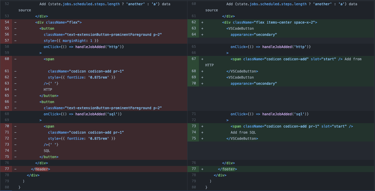
It might look like a small win, but it felt great to replace our home-grown button component (featuring inline styles and oddly specific font sizes) with the brand new VSCodeButton component. These are the kinds of refactors that keep our codebase feeling clean.
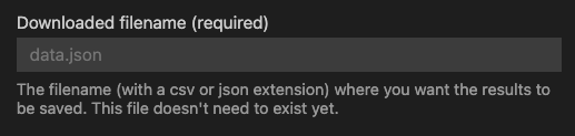
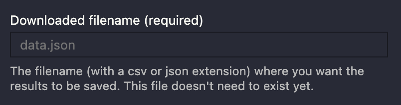
In rare occasions, however, we needed to access values from the underlying VS Code theme that weren't readily surfaced by the Toolkit components. For example, we wanted to add descriptive help text underneath our text fields to better explain what the user needs to provide. The VSCodeTextField component doesn't yet have a dedicated API for this, but we were able to workaround this by using the var(--vscode-descriptionForeground) CSS variable to style this text. And it worked wonderfully across the different themes we tested.
To this end, we migrated away from our old tailwind-vscode plugin (which generates CSS classes corresponding with all of the available CSS variables), instead leveraging Tailwind's JIT compiler to access these values dynamically.
/* Before, using those generated classes */
<p className="text-vscode-descriptionForeground">...</p>

/* After, using Tailwind's arbitrary property syntax */
<p className="text-[color:var(--vscode-descriptionForeground)]">...</p>
Spectrum
That said, finding these specific variable names was not always an easy task. Every webview has access to over 400 theme-specific CSS variables. Our initial strategy involved spelunking through the Chrome DevTools to find what we were looking for, but this wasn't exactly an efficient workflow.
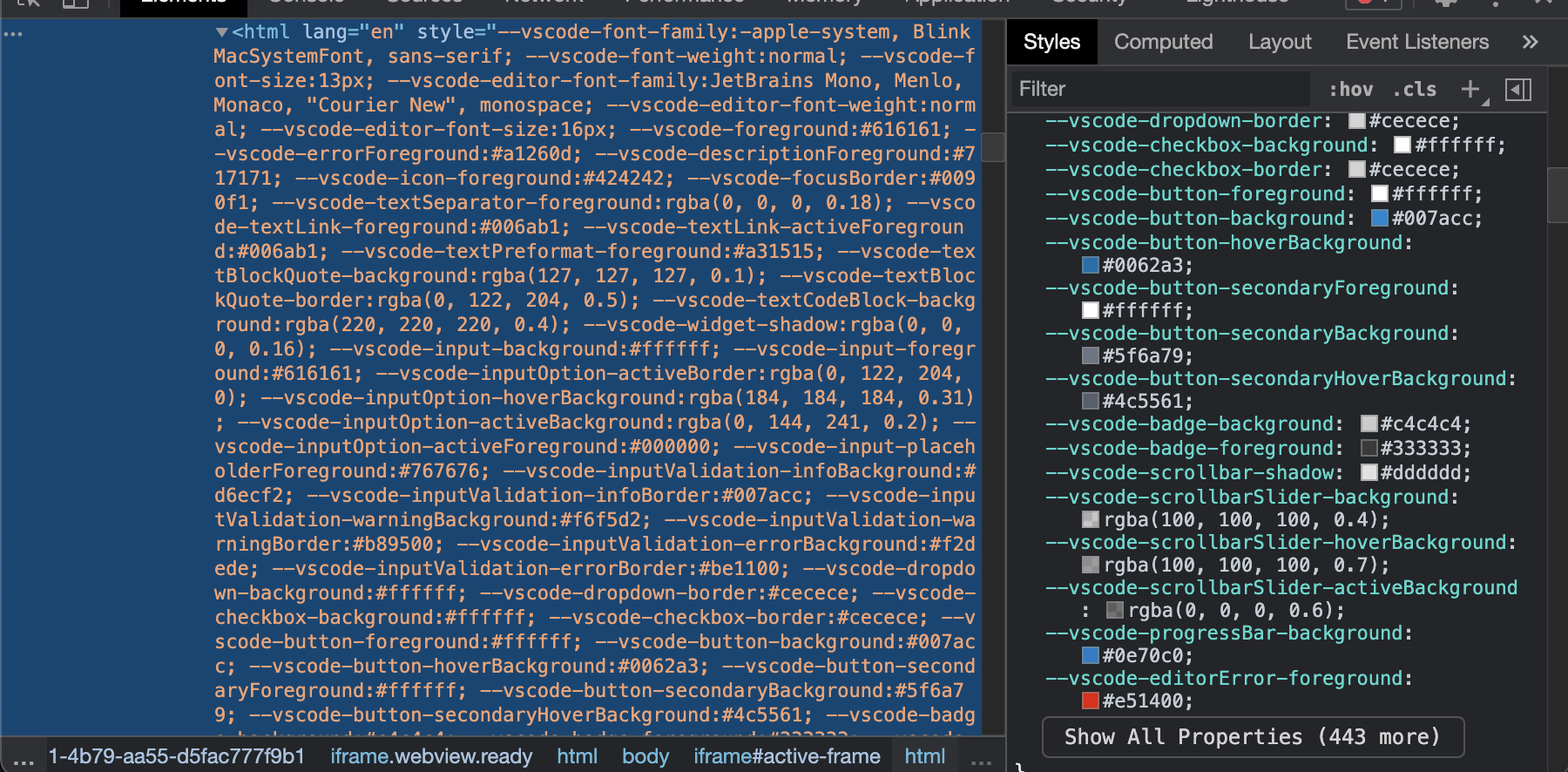
And while these variables are comprehensively documented (there's even an extension that provides intellisense completion for them) we felt like a visual reference was more useful than a text list. To make our lives easier (and as a contribution to the community of webview developers), we built an extension called Spectrum that makes it easy to find and copy these CSS variables.
Rough Edges
While the wrapped React components work wonderfully well, they do have some rough edges.
For instance, at the time of writing, there's an open issue around the use of string literals for component props that are expecting enum values.
// This does NOT work (i.e. TS Error: Type '"password"' is not assignable to type 'TextFieldType | undefined'.)
// TypeScript is looking for the enum type and will not allow a literal string value
// So you must provide TextFieldType.password
<VSCodeTextField type="password"></VSCodeTextField>

// This also does NOT work (i.e. TS Error: Type '"above"' is not assignable to type 'SelectPosition'.)
<VSCodeDropdown position="above">
  <VSCodeOption>Apple</VSCodeOption>
  <VSCodeOption>Banana</VSCodeOption>
  <VSCodeOption>Mango</VSCodeOption>
</VSCodeDropdown>
Another rough edge that might trip up React developers is the behavior of the onChange and onInput props for the <VSCodeTextField /> component. When I first started tinkering with the text field component, I noticed that the onChange event only fired when I blurred away from the focused input, and that the onInput event fired on every keystroke. After raising this issue with the FAST team, they clarified that these behaviors are indeed consistent with the browser's native change and input events. Until this point, I hadn't realized that the React team opted to override this behavior. From the React docs:
The onChange event behaves as you would expect it to: whenever a form field is changed, this event is fired. We intentionally do not use the existing browser behavior because onChange is a misnomer for its behavior and React relies on this event to handle user input in real time.
Take this as a cautionary tale that you should implement controlled text fields in the following manner when using the toolkit components. We are actively working to document these edge cases and oddities in the toolkit, and that work will be landing very soon. Stay tuned!
const [value, setValue] = useState('')

return <VSCodeTextField value={value} onInput={e => setValue(e.target.value)} />
What's next
Our work with the VS Code team isn't done just yet. We're contributing a dedicated Storybook instance for the wrapped React components, as well as exploring the possibility of creating Svelte and Vue wrapped versions of the toolkit components.
In the interim, we'd love to know what you're building with this library. Tweet us at @GitHubNext or send us an email at next@github.com.
✌️ ❤️
GitHub Next
Developer Experience Team